Caregiving.
Care Give Track -App
The problem
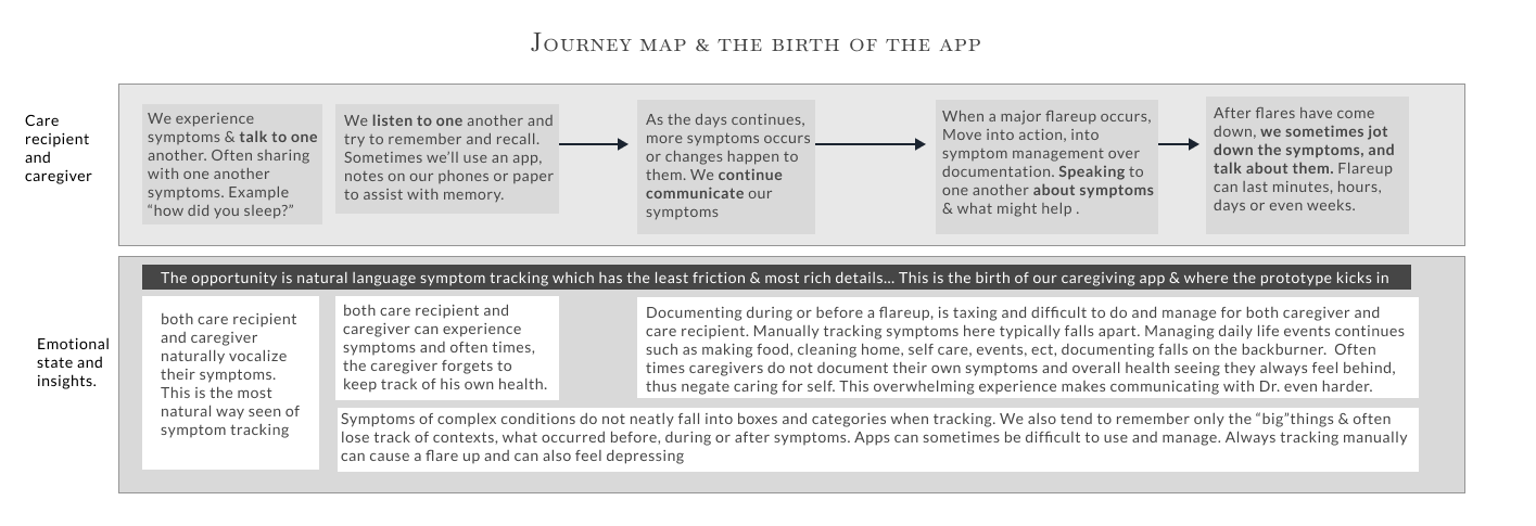
The role of caregiving for an adult is not only physically, mentally and emotionally difficult - it’s also hard to adapt to as you strive to help the one you love. One of the biggest challenges to caregiving is symptom tracking. Symptom tracking is even harder for the care recipient, especially when there are dynamic chronic disease, illness and disabilities in the mix. During this process of managing conditions, caregivers often become overwhelmed and do not keep up with their own health and symptom tracking. Symptom tracking is important to understand one’s condition(s), manage them, and share with doctors to partner in their care. There are plenty of apps out there, but they are hard to use, forces symptoms in boxes and take up a lot of extra time & energy.
The approach
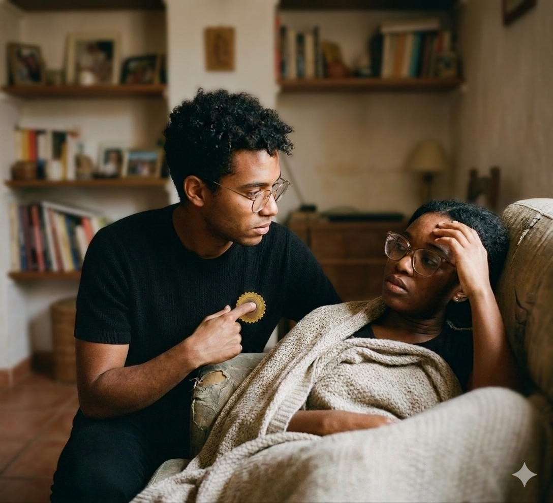
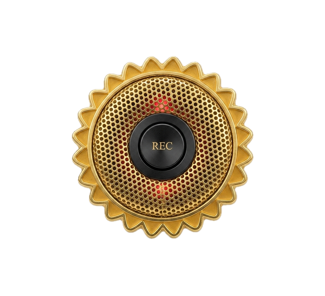
Our hypothesis was that symptom tracking in natural language & in natural settings would yield best results with contexts, easy to use and executable consistently. The approach we took was the design thinking method with a mindset on speed & resourcefulness. Our hypothesis was tested very quickly, free and utilizing the resources readily available to us…Apple Shortcuts, an iPhone and Google Gemni. The next evolution of this product is a physical device that would be modeled after the globally recognized symbol of invisible disabilities, the sunflower. A physical device increases usability, enhances audio, increases accessibility and can be used to bring awareness.
AI design and consideration
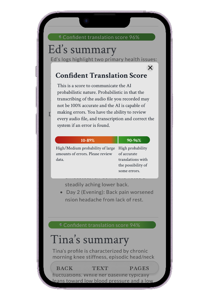
After testing and using our own experience, we notice that the ai output would have to have some design considerations and our prompt would have to be tweaked based on our overall desired outcome, which is our starting point for the design of the prompt. Our design changes to the output of the ai model, we felt made the overall experience better. We design the output to be mobile first and have font size & contrast control, something we don’t see in ai models. We also wanted to give the user(s) and understanding that ai is probabilistic and not deterministic and will make errors, and yet, we. wanted to instill a level of confidence in the ai ability given a high quality data, good prompts, ect. We wanted the user to be in control of their data, outcomes and health and play a part in making the model better so that can get a better experience overall.

No audio in video. This is the prototype I have been using successfully capturing natural conversations of symptoms using apple shortcuts, iCloud and AI.
Learning quickly by using what’s already available, familiar and accessible.
I was able to build out this prototype without much overthinking, overworking and over designing. I was able to get what was needed quickly, no code, no ai co-build, just a down & dirty way to test my hypothesis quickly and consistently throughout the weeks. This video shows how the prototype works, an Apple shortcut triggered by tapping the back of the phone.
Designing for transparency and yet also confidence.
We also wanted to give the user(s) and understanding that ai is probabilistic and not deterministic and will make errors. Yet, we wanted to instill a level of confidence in the ai ability given high quality data, good prompt, ect. We wanted the user to be in control of their data, outcomes and health and play a part in making the model better so that they can get a better experience overall. If the confident translation score isn’t high enough for the user, they can edit and or correct the transcription on the spot.
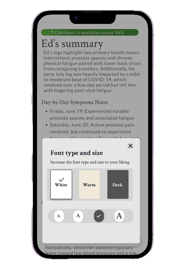
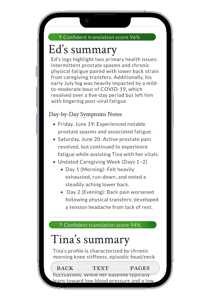
Audio and text are two of the most common form of output in AI models and has become what people expect, a developing mental model. Text is the most common output in ai apps but their structure sometimes are not design with reading in mind, at least from my observation. We decided to change how reading ai output looks and feels in our “Summary”. The summary has controls we have come to know and use such a “reader mode” on the web. The readability and accessibility of the output is just as important as the audio recording quality and AI analysis so we created an experience just for that.
If output is primarily text, make reading accessible and customizable so that customers can better digest the summary.
The next step
In the next evolution of caregiving app (Care Give Track -App), we turn to physical product, 1 button experience that has 1 objective, listen/transcribe/analyze. Physical pin ensures the device is always on you, serves as a symbol of awareness and has an easy user experience. We leveraged the universal symbol of invisible disabilities (Sunflower) as one of the pin options for the caregiver and or care recipient.